Bytes: Transforming Vision into Reality
A strategic branding initiative by Ryse Designs that positioned Bytes as a leader in AI-driven automation and cloud-based solutions. This transformation strengthened Bytes’s market presence and established a clear, future-focused identity.
About the Project
The Client
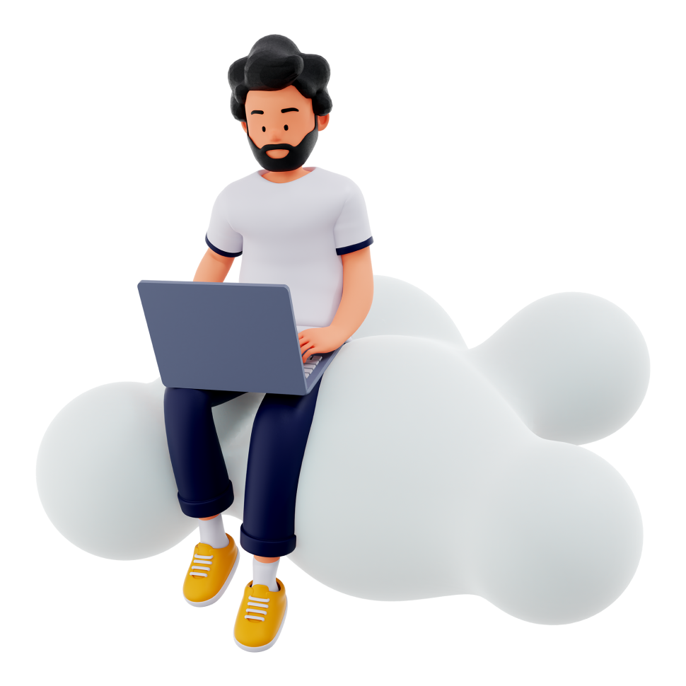
Bytes, a dynamic software house, specializes in AI automation, cloud solutions, and custom software development. Their goal is to empower businesses with scalable, secure, and intelligent solutions that enhance efficiency and drive digital transformation.
Services We Provided
Brand Strategy, Visual Identity, Digital Presence, Brand Guidelines.
Timeline
6 months
Business Challenge
01
Establishing Bytes as a trusted AI and cloud solutions provider in a competitive market.
02
Balancing technical expertise with an accessible brand identity for businesses of all sizes.
03
Ensuring brand consistency across diverse service offerings.
Strategic Approach
Under Mohtady’s leadership, we developed a comprehensive brand strategy centered on the concept “Transforming Vision into Reality.” This positioning perfectly captured Bytes’s role in bridging technological innovation with practical business applications, while establishing them as thought leaders in the AI and cloud computing space.
Brand Evolution
The visual identity system we created reflects Bytes’s technological sophistication while maintaining professional approachability. The brand features a distinctive color palette with carefully selected colors that passed contrast testing for accessibility and visual impact:
Blue
#2063AD
Trust, stability and technological innovation
Green
#88BD24
Growth, sustainability and forward-thinking
Red
#EB5A50
Alerts, calls-to-action and highlights
Purple
#351C47
Depth and sophistication
White
#FFFFFF
Clean space and readability across all applications
The typography system utilizes Montserrat for headlines and Open Sans for body text in English content, providing a modern yet approachable typographic hierarchy. For Arabic content, we implemented Noto Kufi Arabic and Redex fonts, ensuring excellent readability across all platforms while reinforcing the tech-forward brand positioning.
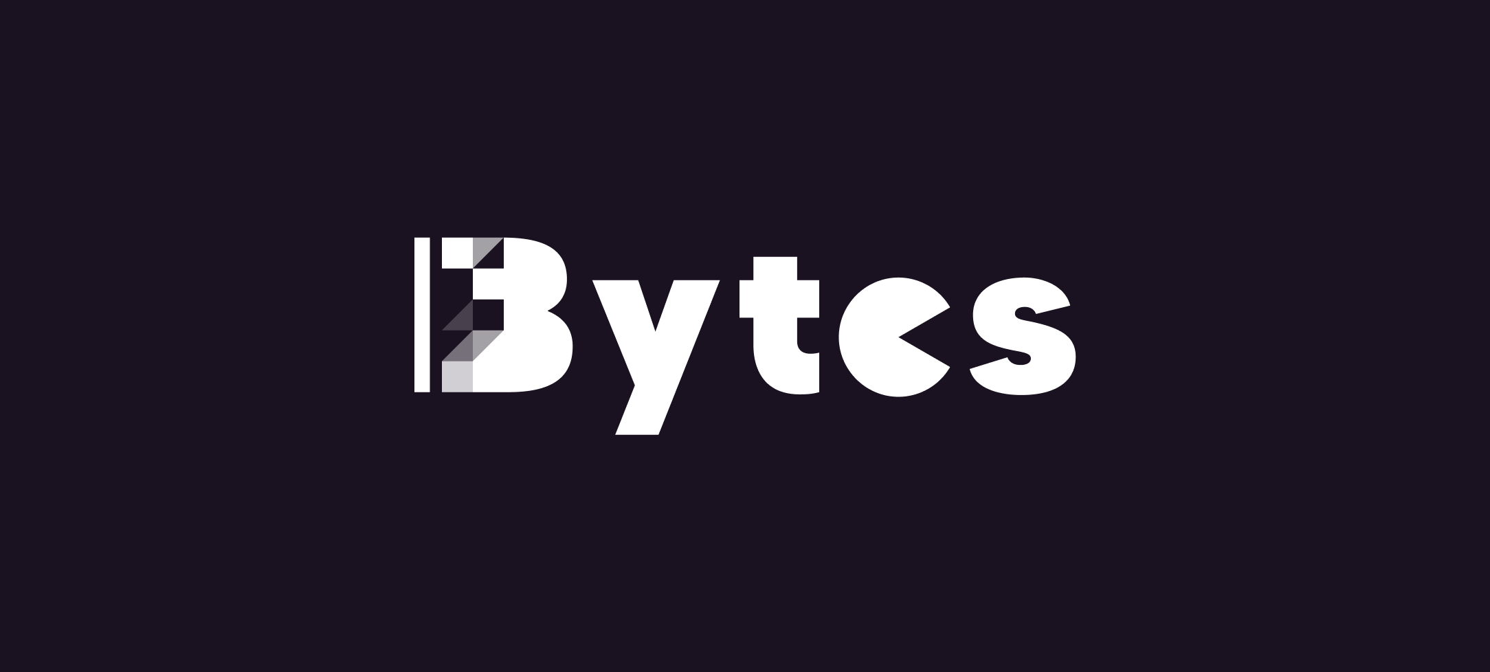
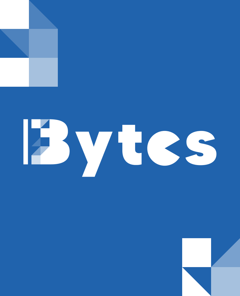
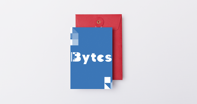
Logo Design & Implementation
The Bytes logo features a minimalist geometric icon representing data flow and connectivity, paired with a clean wordmark in Montserrat Bold. The primary logo uses Blue (#2063AD) with Green (#88BD24) accent elements that suggest growth and intelligence. We established strict usage guidelines including a 3x exclusion zone to ensure brand integrity across all applications.
The logo system includes multiple variations for different contexts: full color on white for primary use, reversed white on blue for dark backgrounds, monochrome for limited color applications, and a responsive icon-only version for small digital touchpoints—all carefully designed to maintain optimal visibility and brand recognition across diverse platforms.
Implementation Details
The rebranding effort extended across multiple touchpoints, creating a cohesive experience for Bytes’s clients:
Digital Presence
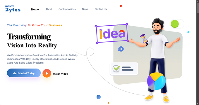
We developed a responsive website with a 12-column grid system and 8px baseline grid for precise alignment. The UI features custom iconography with 2px stroke weights, interactive elements with 300ms transitions, and a component-based design system for scalability. All digital assets maintain consistent spacing (24px margins on mobile, 48px on desktop) and utilize CSS variables for theming flexibility. The site achieves WCAG 2.1 AA compliance with a minimum contrast ratio of 4.5:1 for text elements, leveraging our carefully tested color palette.
Corporate Materials
Our team designed business collateral with precise CMYK color values for all brand colors, created presentation templates with 24pt headlines in Montserrat SemiBold, developed documentation systems with 1.6x line spacing for optimal readability in both English and Arabic, and produced trade show materials with 15mm margins to ensure brand consistency across all touchpoints. All print materials use a 5mm corner radius for rectangular elements to maintain visual consistency with digital interfaces.
Results
48%
Increase in brand recognition
5
New enterprise clients acquired
37%
Growth in lead generation
Impact
The rebranding significantly elevated Bytes’s position in the competitive tech solutions market. It strengthened their credibility among enterprise clients while making their advanced AI and cloud offerings more accessible to mid-market businesses. The cohesive brand experience across all touchpoints improved client engagement and shortened sales cycles by clearly communicating the company’s value proposition.
Through this strategic rebranding, Ryse Designs helped Bytes establish itself as a leading force in AI-driven business solutions. The new brand identity continues to support their growth and innovation in the rapidly evolving technology landscape.
Client’s Feedback
“Ryse Designs delivered a brand transformation that perfectly captures our technological capabilities while making our solutions more approachable to businesses of all sizes. The new identity has been instrumental in our market expansion and establishing credibility with enterprise clients.”
— Sarah Chen, CEO, Bytes
Project Credits
Lead Designer: Mohtady
Agency: Ryse Designs
Year: 2022
Services: Brand Strategy, Visual Identity, Digital Presence, Brand Guidelines